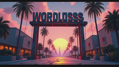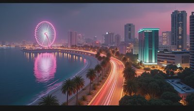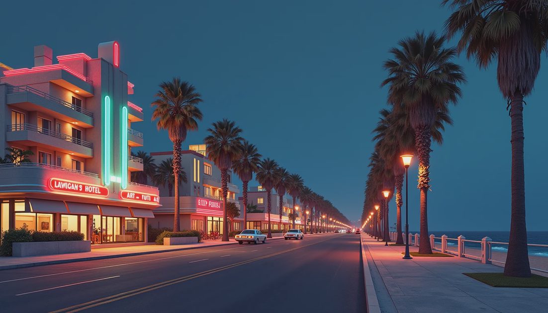
Ocean Drive is one of Vice City’s clearest statements of place: hotels on one side, open coastal space on the other, and a road carrying the player between them.
At night, that arrangement becomes a lesson in contrast.
Bright facade accents establish a commercial edge. Palms interrupt the skyline. The darker beach side gives the hotel strip room to stand out.
This article discusses the visual design associated with the original 2002 Vice City. It does not claim a fresh comparison of every port, remaster, modification, or display setting.
My interest is the design behind the familiar image: a recognizable street built from a small number of strong relationships.
ON THIS PAGE
Two sides of the same street
Why the hotels remain readable
The value of darkness
A useful route for looking
FAQ
Two sides of the same street
The beachfront road gains its identity from an unequal pair of edges.
Buildings occupy the urban side. The beach and coastal open space create a different boundary opposite them.
The street is therefore not a corridor of identical density.
One side repeatedly offers facades, entrances, and signs. The other allows more air and a longer visual release.
That arrangement is useful in a driving game.
A player does not need to inspect every building to understand the district’s general character. A quick view can communicate “hotel strip beside the beach” before individual details become readable.
I find that spatial economy appealing.
The place has a clear sentence behind it. Individual hotels can differ while still belonging to the same recognizable strip.
It also gives the lighting a direction. Bright commercial architecture faces a road with enough open space nearby for the colors to remain distinct.
Why the hotels remain readable
Vice City’s Art Deco vocabulary favors strong outlines and repeated forms: horizontal bands, stepped shapes, rounded corners, and emphatic facade details.
Those choices make buildings recognizable through silhouette and rhythm rather than fine surface detail alone.
The Ocean View Hotel is a useful reference point because it connects the street’s appearance with an early story function as Tommy’s initial safehouse.
Its presence is more than a distant landmark. The player has a practical reason to recognize and return to it.
That does not require every neighboring building to carry an equally elaborate function.
A recurring architectural language allows background structures to support the place even when they are not central destinations.
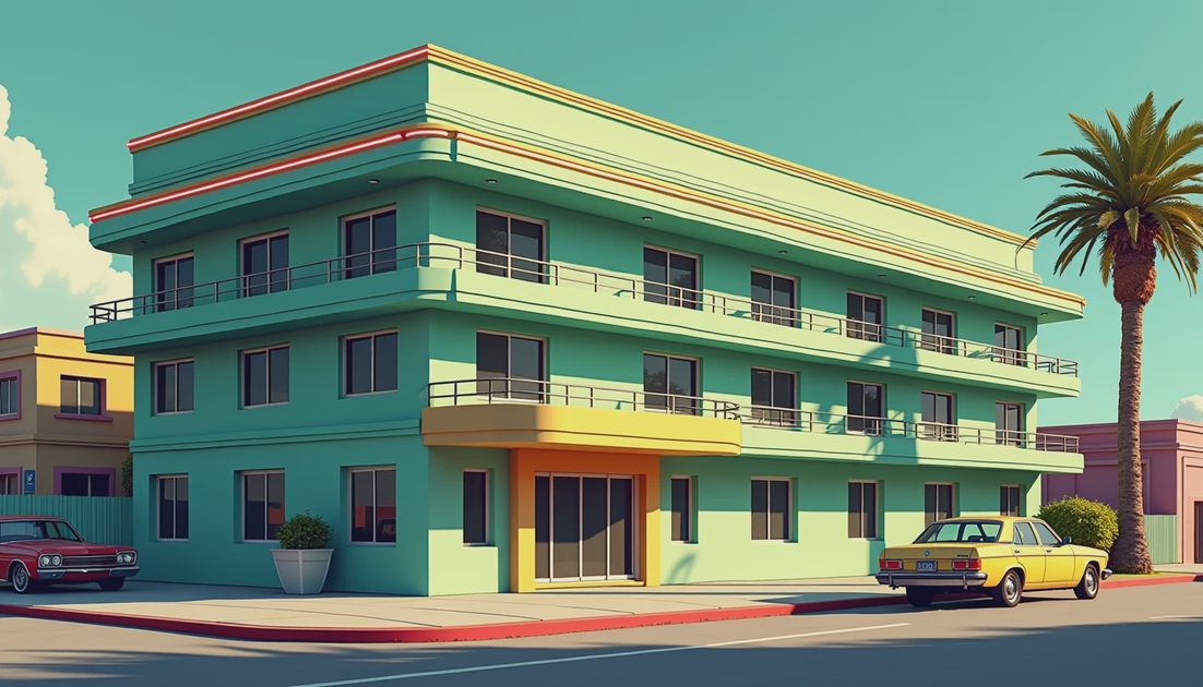
At night, colored accents help separate parts of a facade.
The effect depends on proportion. A narrow illuminated line can describe an edge without covering the whole building in uniform brightness.
I would describe the result as graphic clarity.
It is not simply a matter of older hardware showing less. The scene uses contrast and silhouette to make a limited set of forms memorable.
Element | Visual contribution | Value from the road |
|---|---|---|
Horizontal facade bands | Repeated architectural rhythm | Easy to register while moving |
Colored accents | Separation between surfaces | Keeps the hotel edge distinct |
Palms | Vertical interruptions | Breaks up repeated building shapes |
Open beach side | Lower visual density | Gives the brighter side breathing room |
The value of darkness
A night scene does not become stronger just because every corner becomes brighter.
Ocean Drive’s appeal depends partly on the difference between illuminated architecture and less illuminated space.
The darker areas prevent the color from turning into a continuous wash. They give the eye a pause and preserve the distinction between commercial frontage and coastal environment.
This is where “more realistic” can become an unhelpful shortcut in version comparisons.
A later lighting treatment may reveal additional surfaces while changing the original balance of emphasis.
That does not automatically make one version superior. It means the comparison needs a stated criterion.
Are we judging visibility, atmosphere, material detail, or faithfulness to a particular color treatment?
Those are different questions.
I am not presenting a measured cross-version comparison here. The practical point is to identify the original visual relationship before assuming that a brighter image has improved it.
A useful route for looking
If you want to examine the street yourself, separate observation from mission progress.
A calm free-roam visit is better suited to reading facades than a timed objective.
Stop somewhere safe within the game’s traffic flow, then compare three views:
Along the road: look for repeated building shapes and palm spacing.
Toward the hotels: notice where color defines an edge, band, or entrance.
Toward the coast: compare the amount of detail and available light.
This is a suggested viewing exercise, not a claim that I completed a new test on a particular build.
If you intend to compare screenshots, record the edition, platform, weather, approximate in-game time, and any modifications.
Otherwise, differences in conditions can quietly become differences attributed to the game itself.
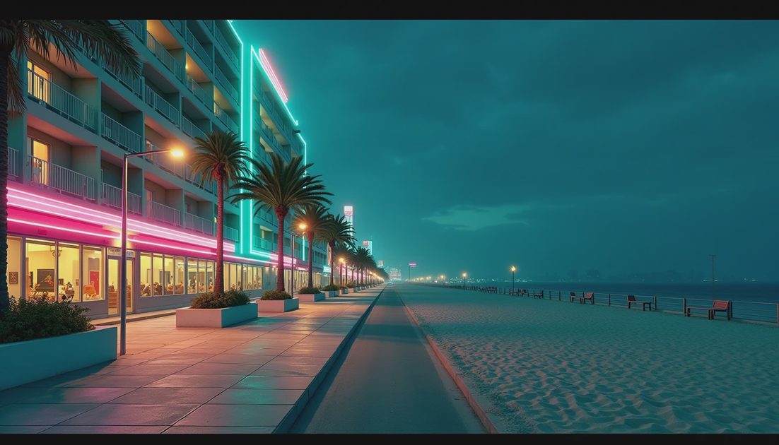
One carefully chosen position can reveal more than a fast tour.
It lets you ask which features remain recognizable when you ignore the signs and which depend heavily on color.
The street becomes especially legible when both sides remain in view rather than cropping the hotels into an isolated postcard.
Movement is part of the art direction
Ocean Drive is not only a collection of buildings to inspect while standing still.
It is a route.
That changes what the architecture needs to accomplish. A strong outline and a repeated band can survive a passing glance more effectively than tiny decorative detail.
A landmark also gains value through return.
Approaching a familiar hotel from another direction can turn its shape into orientation rather than decoration.
This is one reason I hesitate to evaluate the strip through still-image detail alone.
The road, camera movement, and repeated journeys help make the architecture meaningful.
The city’s visual identity develops through recognition as well as first impressions.
Nostalgia is a response, not a measurement
It is reasonable to prefer a particular version’s atmosphere. The useful next step is to describe what creates that preference.
For me, the strongest idea is the contrast between a bright strip of performed glamour and the comparatively open coast.
That gives the preference something concrete to rest on.
It also makes the discussion useful for someone who did not play the game in 2002. They can examine the same relationships without being asked to share someone else’s memories.
“More nostalgic” explains a reaction. It does not identify the design decision behind it.
Architecture, road alignment, palms, color, and darkness offer a more useful vocabulary.
The street works because those choices reinforce one another instead of competing for equal emphasis.
FAQ
Is this a Definitive Edition graphics review?
No. The focus is the original game’s environmental design. No fresh cross-version benchmark is claimed.
Is every colorful light technically neon?
That is not established here.
“Neon” describes the strip’s familiar visual impression. The analysis concerns color and placement rather than simulated lamp technology.
Why discuss a road in an article about art?
Because movement shapes how the art is read.
Facades need to communicate as the player approaches, passes, and returns.
Ocean Drive’s most useful lesson is that a memorable street does not need equal detail everywhere. It needs the right differences in the right places.
There’s always a story on the next block.