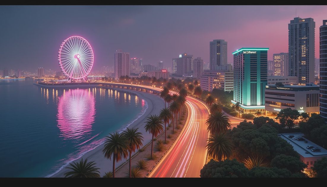
The easiest way to flatten Vice City is to call every illuminated scene “neon.” Rockstar’s published imagery offers a more interesting mixture: violet evening sky, warm windows, pale green architectural lighting, vehicle headlights, and bright displays competing at different distances.
The official nighttime city image featuring an observation wheel and the Vice City Arts Center is particularly useful. It contains an entire lighting hierarchy in one frame. The city reads through differences in brightness, scale, and color rather than through a single pink filter.
That distinction is what interests me. This is a reading of the art direction visible in official material, not a graphics benchmark or a claim about the game’s complete rendering technology.
ON THIS PAGE
The skyline is only one layer
Warm windows, cool buildings
The road remains part of the picture
Dusk is not the same as night
FAQ
The skyline is only one layer
Start with the observation wheel. Its illuminated circle remains recognizable at a distance, even before individual buildings become easy to identify.
Below it, roads and waterfront structures divide the view into smaller areas. Closer to the camera, the Arts Center’s pale green exterior lighting gives a substantial building a distinct volume. Farther away, small warm windows suggest occupation without competing individually with the main landmarks.
The arrangement creates several levels of attention:
Visual layer | Visible cue | What it contributes |
|---|---|---|
Distant landmark | Illuminated observation wheel | A recognizable shape against the waterfront |
Major buildings | Broad architectural lighting | Separation between large structures |
Street network | Headlights and streetlights | Routes through the district |
Background occupation | Small window lights | Depth and a sense of inhabited space |
I like how much of the scene remains relatively dark. Those quieter areas give the bright ones something to stand against.
If every facade had the same intensity, the image would contain more light but less hierarchy. The eye would have fewer reasons to distinguish one place from another.
Warm windows, cool buildings
The contrast between warm windows and cooler exterior lighting does practical work.
Yellow windows divide a neighboring building into smaller units. The Arts Center’s cooler illumination emphasizes broader surfaces and architectural form. One structure reads through a grid; another reads through its overall shape.
That does not mean every warm interior is welcoming or every cool building is threatening. Those would be story conclusions unsupported by this view.
The immediate effect is simpler: the viewer can separate buildings before reading their names.
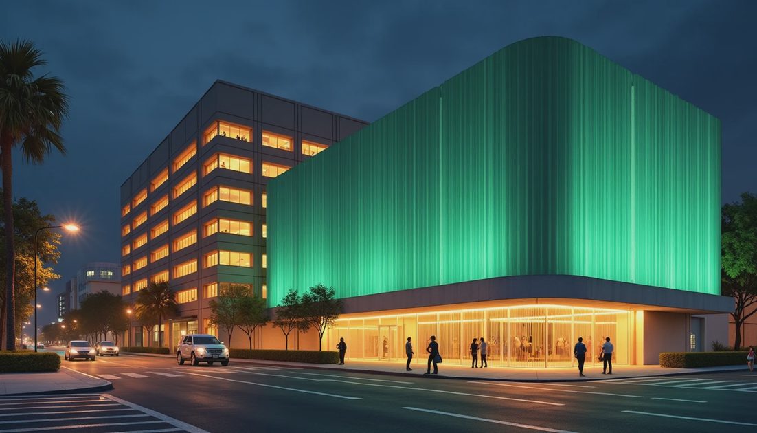
A bright billboard introduces another category of light. It is a display surface asking for attention, rather than a window suggesting activity behind it.
That difference helps the district feel commercially active. The city is not just illuminated; different parts of it appear to be competing for different kinds of attention.
My first impression is that this is a place designed to be looked at. My second is that the image carefully controls which surfaces win.
The road remains part of the picture
A convincing night scene needs more than an attractive skyline. It needs a ground plane that remains understandable beneath the spectacle.
In this official view, vehicles and illuminated streets are still legible below the larger venues. Their smaller lights create a different rhythm from the broad colored surfaces above them.
The road becomes a route through the composition rather than an empty gap between postcard subjects.
That matters for a driving game, but it is important to stop short of a gameplay verdict. A promotional composition cannot establish how easily someone will read a bend at speed.
Camera height, motion blur, weather, display brightness, and interface elements can all change the experience.
I would therefore separate two claims:
Visible here: streets help organize the nighttime image.
Still requiring gameplay evidence: those streets remain equally readable under different driving conditions.
A useful viewing exercise is to ignore the observation wheel and follow the roads through the lower half of the frame. The scene still has structure after its most obvious landmark loses your attention.
That is a stronger achievement than simply placing a bright attraction in the distance.
Dusk is not the same as night
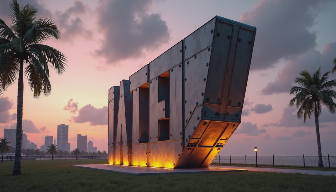
The official image of the giant VICE CITY letters uses warm uplighting beneath a pink and gray sky. It belongs to a different lighting situation.
At dusk, the sky still explains the outlines of palms, lettering, support structures, and the aircraft above the sign. Artificial lighting adds emphasis rather than supplying nearly all the scene’s visibility.
The nighttime waterfront image works differently. Windows, traffic, display panels, and architectural lighting carry much more of the visual structure.
That difference makes comparisons more useful.
Two images may look dramatically different because they depict different times of day. Weather and exposure can also change the result. Neither difference automatically proves a change in rendering technology.
I would rather describe the visible conditions precisely than turn a sunset into a technical claim about global illumination.
The useful question is not simply how bright Vice City becomes. It is which parts of the city the light allows us to distinguish.
What the lighting tells us about the city
The strongest conclusion is about art direction.
Different sources of light establish different kinds of space. A venue advertises itself. A window suggests occupation. A road supports movement. A landmark organizes the larger view.
Together, they make the district appear active without requiring us to invent a fully simulated nightlife economy.
There is also an interesting balance between public and private presence. A venue projects its identity outward. A small apartment window contributes only a point of light.
Both matter, but they work at different scales.
For anyone comparing future official images, I would keep a short observation log:
Identify the light sources that are actually visible.
Describe the apparent time of day without inventing an exact clock time.
Separate architecture, signage, windows, and traffic.
Compare similar conditions before making a graphics judgment.
Those notes do not need to become a technical benchmark. Their purpose is to make an impression specific enough that another person can examine it.
“Looks atmospheric” is a reasonable reaction. Explaining the warm windows, cooler facades, and darker gaps makes that reaction useful.
FAQ
Does this nighttime image prove ray tracing?
A screenshot alone cannot identify the complete rendering pipeline.
Similar visible effects can come from different combinations of techniques. An attractive reflection or soft light transition is not a complete technical explanation.
Does the observation wheel confirm a playable attraction?
It confirms a visible landmark in this image.
Whether players can use it requires separate evidence about interaction.
Why avoid describing everything as neon?
Because the differences are the interesting part.
Windows, headlights, floodlights, illuminated facades, and display panels contribute different visual information.
For me, Vice City becomes convincing when the smaller lights still matter after the largest ones have made their first impression.
There’s always a story on the next block.