A city starts explaining itself before anyone speaks. A hotel name tells visitors where to spend money. A civic label tells them what deserves attention. A giant city sign turns a place into a brand.
That is the useful starting point for reading GTA VI’s signs. Rockstar’s official Vice City screenshots provide concrete examples: the freestanding VICE CITY letters, the Hotel Valetta facade, and the Vice City Arts Center label. They perform different jobs even when they occupy the same fictional city.
My interest is in that difference. This is a close reading of published images, not a reconstructed road network or a claim that every visible building is accessible.
ON THIS PAGE
Three kinds of signs
The city name as an advertisement
Hotel lettering and everyday scale
Reading signs without inventing a map
FAQ
Three kinds of signs
Before zooming into letters, identify what a sign is trying to accomplish. Its function changes how much information you can reasonably extract from it.
Visible example | Main visual job | What it does not establish |
|---|---|---|
Giant VICE CITY letters | Turn the city into a recognizable image | A playable boundary or exact approach road |
Hotel Valetta lettering | Give one building a commercial identity | Bookable rooms or an accessible lobby |
Vice City Arts Center label | Identify a cultural institution | An activity, mission, or interior |
A destination sign helps someone get somewhere. Branding helps someone recognize somewhere. Those are related tasks, but they are not interchangeable.
That distinction matters when a screenshot circulates as evidence for an elaborate fan map. A readable building name can support a location label. It cannot establish every street between that building and another image.
The city name as an advertisement
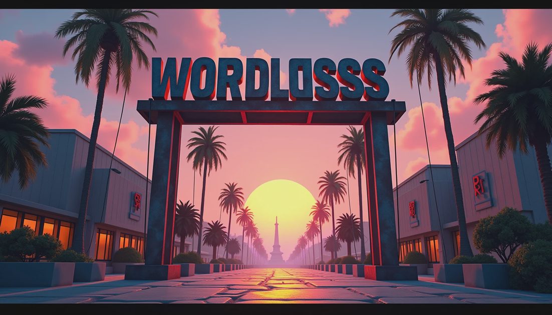
In the official image with the enormous VICE CITY letters, the sign is a physical structure. Rear supports and cables interrupt the clean silhouette. Weathering gives the letters a surface rather than leaving them as a flat graphic pasted over the scene.
Warm illumination rises from below while the sky remains pink and gray. Palms and an aircraft expand the frame beyond the lettering. The result connects a manufactured landmark with travel, climate, and arrival.
I find the supports especially effective. A spotless wordmark would advertise the game. Visible infrastructure makes the sign feel like something people maintain inside the world.
There is also a useful distance effect. Large letters work before small print becomes legible. The city announces itself at a scale suited to a passing view, which fits a series so often experienced from a moving vehicle.
That is an observation about composition. It does not prove which vehicle the player can use to approach this exact spot, whether the aircraft has a scheduled route, or whether the sign has an associated mission.
My reading: the landmark sells the idea of arriving in Vice City before it explains how to navigate Vice City.
Hotel lettering and everyday scale
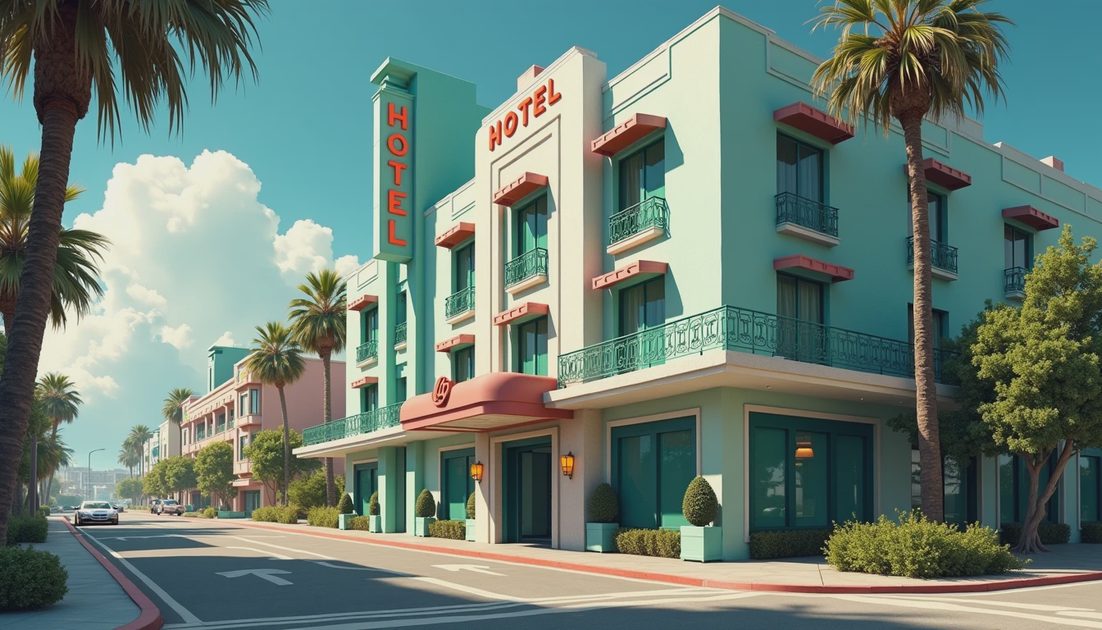
The daytime official city image containing Hotel Valetta uses a different hierarchy. The hotel name belongs to a specific facade beside balconies, terraces, water, and surrounding roads. It is one identity among many structures rather than the identity of the entire skyline.
That smaller scale makes the neighborhood more convincing. A city needs businesses that explain why people gather in particular buildings. A hotel suggests visitors, service work, leisure, and temporary stays without requiring a cutscene to introduce each function.
Look at the relationship between lettering and architecture. The name remains attached to the building’s form; it does not consume the whole view. Nearby recreation space and traffic give it a setting beyond a promotional portrait.
For me, this is where environmental detail becomes useful storytelling. A business name supplies a modest piece of social information: what this place wants to be, and whom it expects to attract.
The screenshot still leaves practical questions unanswered. We cannot infer a hotel booking system, a player property, or a fully modeled reception area from a name and a terrace.
Civic labels change the register
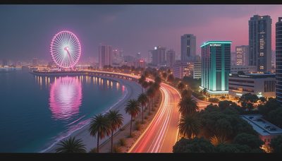
The nighttime image containing the Vice City Arts Center places institutional lettering among illuminated venues, roads, a waterfront, and a distant observation wheel. Here the words help organize a district of public spectacle.
Commercial and civic identities sit close together. That proximity makes the city feel like a place where culture, entertainment, and spending compete for the same evening attention.
I would resist calling every bright facade a nightlife activity. The stronger point is visual: labels help distinguish buildings within a dense field of light. They let architecture carry different identities instead of reducing the skyline to anonymous glowing boxes.
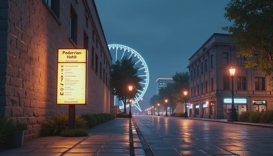
The image also rewards a second look at scale. A landmark wheel is recognizable without readable text. A named institution requires closer attention. The city communicates through both silhouette and language.
Reading signs without inventing a map
A useful sign analysis needs two separate notes: what is readable and what you think it implies. Combining them too early is how a cautious observation becomes a confident rumor.
My practical checklist is short:
Read the whole uncropped frame before enlarging a sign.
Record only lettering that remains clear at the available resolution.
Identify whether the sign names a city, building, business, or direction.
Keep any route or gameplay interpretation in a separate sentence.
Compression matters. A blurry line of pixels can look like several different words, especially after sharpening. If the original does not resolve the letters, a cleaner-looking enlargement should not become new evidence.
The most interesting question is often simpler than identifying another map coordinate: what kind of place is advertising itself here? That question produces a grounded reading even when the precise geography remains unknown.
FAQ
Do these signs confirm accessible buildings?
No. They establish visible identities in official images. Interior access needs separate evidence.
Can the screenshots establish a complete street layout?
No. Individual views do not supply all the connections, distances, or elevations between locations.
Why pay attention to ordinary business names?
They explain the city at human scale. A skyline supplies shape; business and institutional labels suggest how people use the places beneath it.
The next time a screenshot appears, I would start with the words already readable inside it. They usually offer a better story than a sharpened guess at the edge of the frame.
There’s always a story on the next block.